

May Charts Wrap-up
Insights and Patterns: A Monthly Dive into Stock Chart Analysis for the Average Investor

While my investing focus is often on fundamentals, there's a wealth of insight to be gained from simple stock chart patterns. In this monthly series of blog posts, I'll break down some straightforward yet perceptive chart patterns that can be identified in a select group of individual stocks. These patterns have been previously taught in earlier blog posts, which you can find at the end of this article. As always, exercise your own discretion and judgment when making financial decisions, as this is not investment advice.
S&P 500
April recap: May will determine the next move—either a decisive break above this key level or a continued downtrend back toward the 200-week MA. A catalyst will be necessary to drive such a move, and given the hidden bearish divergence pattern, I anticipate a near-term pullback. However, the ultimate direction will depend on external factors.
Yes, we are still in a bullish market. Read my previous article to understand why. The first blue trend line (labelled as #1) was key for my analysis. As the rise in the index approached back to this line, I reiterated that a break above would establish that we are still bullish, but a break to the downside would initiate a bearish pattern. What did it do? It broke to the upside.

At some point, a retest of line #1 is anticipated. It is important to note that fundamentals are not dictating the narrative; rather, it is driven by headlines. This trend is expected to persist. If tariff negotiations ease further, an upside is likely. Conversely, if tariff discussions intensify, a downside may occur, potentially leading to a retest of line #2 which closely aligns with the trendline the lows since the pandemic. Once that second line breaks, that is your ultimate sign that we are headed much lower.
The rapid and nearly vertical rise of this index since the 2008 financial crisis is striking. In response to the crisis, central banks—particularly the Federal Reserve—slashed interest rates to near zero, making borrowing cheap and fueling corporate investment and consumer spending. With bond yields and savings returns at historic lows, investors flocked to stocks in search of better gains. Quantitative easing (QE), in which the Fed injected trillions into financial markets, further inflated asset prices. Even as rates eventually climbed, the lingering effects of prolonged easy money remained. Then came the pandemic, bringing unprecedented fiscal stimulus—trillions in direct payments, PPP loans, and infrastructure spending—flooding the economy with liquidity. Much of this excess cash found its way into equities, leaving us in a precarious position, waiting for the next major crash.
It is fascinating to observe the Federal Reserve's firm control under Trump. I have explained that tariffs are not inherently inflation unless contributing factors are present. The willingness of Federal Reserve to cut rates during Biden's term to create a more favourable economic environment under his administration is concerning. The economy during that period was weak in reality, sustained primarily by extensive government stimulus and quantitative easing. Now, under Trump, with inflation returning to normal levels and signs of emerging stressors, there appears to be no sense of urgency. This highlights a clear example of why the Federal Reserve often makes mistakes, as its independence does not seem entirely genuine.
Economic growth slows when liquidity remains stagnant, leading to deflationary pressures as constrained consumer spending forces businesses to limit price increases. Rising costs from factors like tariffs or supply chain disruptions can shrink profit margins, further reducing investment and hiring, which weakens demand and exacerbates deflation. Conversely, inflation arises when liquidity increases—through wage growth, credit expansion, or monetary policy—allowing consumers to spend more and businesses to raise prices without losing customers. Ultimately, sustained inflation depends on increasing liquidity to drive demand.

Gold (GLD)
April recap: GLD has surged to new all-time highs in this volatile month and is now entering a period of consolidation. I anticipate a retest of the top of its long parallel channel around $3,200.
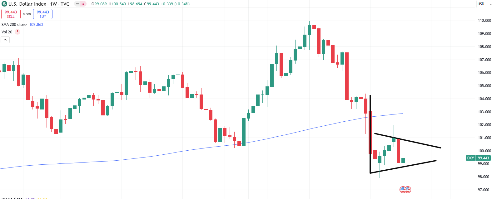
Bingo! Gold has indeed retested the top of the parallel channel and appears to be consolidating in a bull flag, signaling the potential for another significant upward movement. This outlook is further reinforced by the observed pattern in the US Dollar (USD).
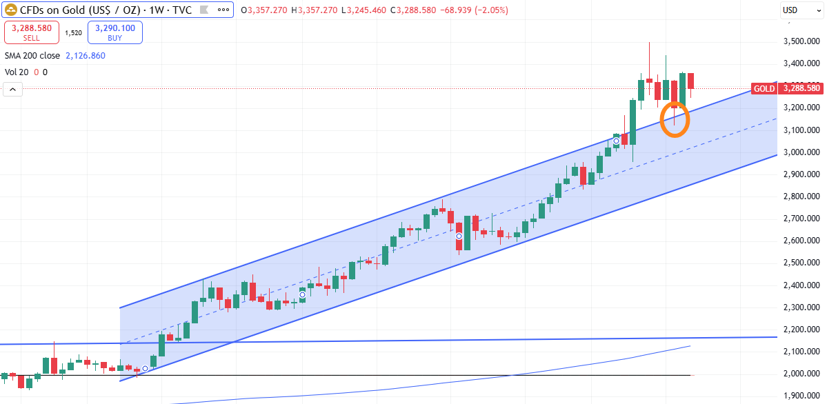
Gold and the U.S. dollar typically move in opposite directions, though this relationship isn’t absolute. When the dollar weakens, gold—priced in USD—becomes more affordable for foreign buyers, driving up demand and prices. Conversely, a stronger dollar makes gold more expensive globally, often leading to price declines.
Currently, the USD is consolidating in a bearish flag pattern, mirroring gold’s movements inversely. If the dollar weakens further, gold prices are likely to surge. However, in the long run, the dollar is expected to strengthen—most likely in response to a global economic downturn, when liquidity concerns drive demand for USD as the world’s reserve currency. The key question at that point remains: will gold maintain its current levels or experience a sharp correction?
Bitcoin (BTC)
April recap: Currently, there is a bullish flag forming and with Microsoft (MSFT) and Meta Platforms (META) having crushed their earnings call, it looks like both the index and Bitcoin are about to pull higher.
Bitcoin’s surge to new all-time highs was a decisive move, but skepticism is growing. The current pattern closely mirrors the 2021–2022 setup, raising concerns about a potential downturn. Additionally, another bearish divergence has emerged (orange arrow)—similar to the previous one (purple arrow) that led to a confirmed drop. Given this setup, some level of pullback seems likely, whether minor or more significant.
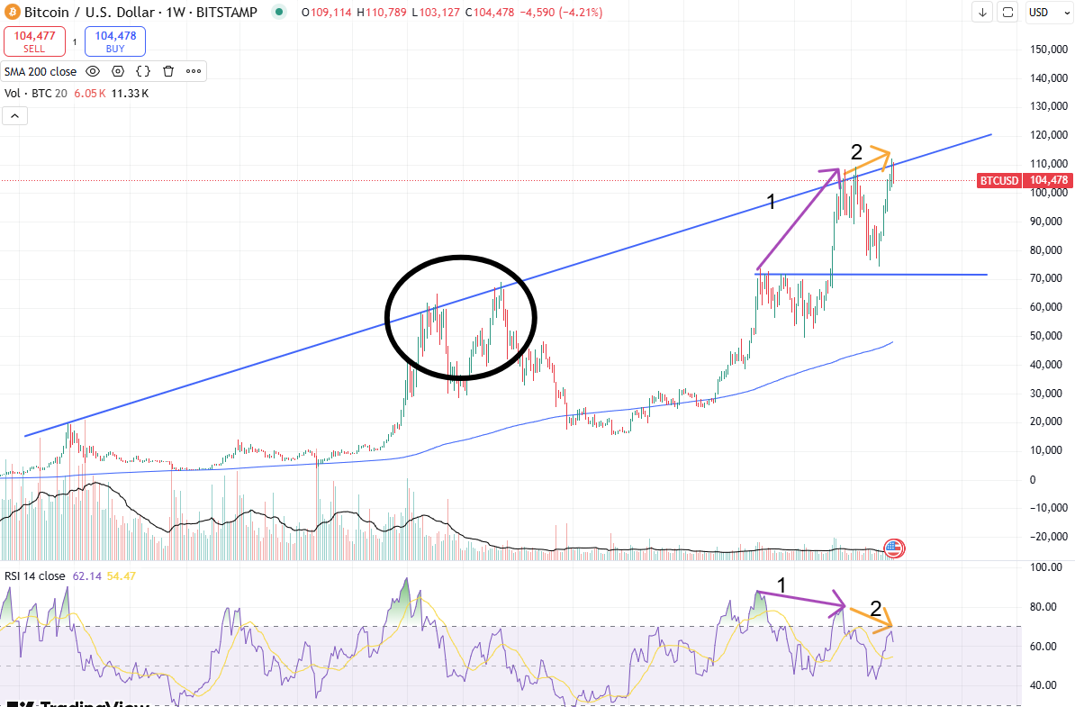
Bitcoin has not decoupled from being a risk asset—it remains closely tied to the Nasdaq (QQQ) index. The chart clearly shows nearly identical patterns, with the only difference being the magnitude of each move. Due to Bitcoin’s higher volatility, its price swings are more pronounced—both upward and downward—compared to QQQ. Simply put, when QQQ rises, Bitcoin follows, and when QQQ declines, Bitcoin moves in tandem. The only difference is the magnitude of the move. The correlation remains intact despite claims of Bitcoin evolving into a safe-haven asset.

Schwab US Dividend Equity ETF (SCHD)
April recap: (…) the 200-week moving average. Look at all the hits on the thin, blue line since 2016.
Yes, SCHD is a boring dividend ETF. However, it is a stable and reliable dividend payer, making it a long-term value investment. It is not a technology stock, so significant short-term gains should not be expected. With SCHD, the focus is on the long game. I would emphasize once again the importance of the 200-week moving average.

The key takeaway here isn’t just the reconstitution itself—it’s how SCHD appears to be positioning for a recessionary, or low growth, environment. Its top sectors align with those typically favored during economic downturns. Many holdings currently offer above-average yields, and as those yields normalize, share prices are likely to rise. In the meantime, investors benefit from strong dividend returns, with long-term gains rewarding patience.


Toromont Industries (TIH)
TIH stands out as a strong contender to enhance my Industrial Sector allocation. Since November 2020, it has maintained an ascending parallel channel, resembling a consolidation phase with a gradual upward slope. The hit at the 200-week moving average and the bullish divergence at the channel’s lower boundary signaled an opportune entry point. As I assess my portfolio in the coming weeks, TIH may become a new addition.
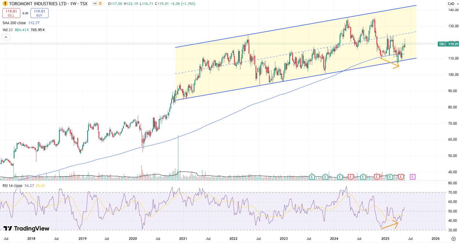
Dividend growth has been stable at 12% per year. Payout ratio hovers around 30%. Balance sheet is exceptional with debt levels very reasonably maintained. Historical averages are showing a buy signal.

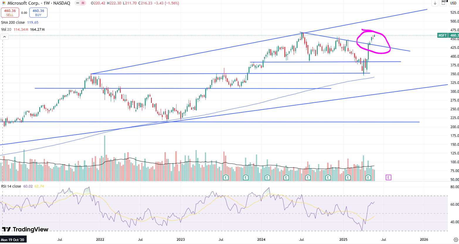
Microsoft (MSFT)
April recap: Now, after a stellar earnings beat, the stock is poised to rebound toward the top of the downward trendline (pink) before its next move.
Microsoft has broken its downtrend line, reinforcing a bullish outlook on the AI-driven rally. While a retest may occur, this breakout opens the door for MSFT to challenge its all-time high and potentially push into the $500 range. The tariff headlines in April provided a timely opportunity to add to positions, further strengthening the case for upside momentum.
Canadian National Railways (CNR)
April recap: Analyzing the chart reveals that it has never been this significantly below its 200-week moving. During the COVID pandemic, it was 12% below that level. Currently, it sits 16% below. With the earnings report set to be released on May 1st, we'll soon find out what impact it may have. Clearly, something is off.
Well, it didn’t take long after my commentary for CNR to wake up. CNR has once again broken out of a downward parallel channel, mirroring its previous move. Despite the price decline, the RSI remained stable, hinting at an eventual reversal. The recent lows presented a solid buying opportunity.
What’s puzzling is CNR’s tendency to struggle in slow-growth economic environments. Could this breakout signal another bullish leg in economic activity, or is it merely a false move? Regardless, CNR remains a strong long-term investment.


Disclaimer
The content provided on this page by the publisher is not guaranteed to be accurate or comprehensive. All opinions and statements expressed herein are solely those of the author. Trading stocks can incur losses of the invested capital. Even all capital can be lost. This page represents my personal strategies, views, and decisions, which may not be appropriate for other investors. Please use common sense or consult with an investment professional before investing your money.

Consider joining DiviStock Chronicles’ Referral Program for more neat rewards!Please refer to the details of the referral program.